Mobvoi is a Chinese AI company invested by Google. Mobvoi's smart products are sold in 56 countries around the world. Mobvoi's overseas official website has the function of promoting the company's image and selling products. The sales volume is occupied by 20% of the total volume on the line. The original version only has some basic functions, there are a lot of users' complaints, such as some operations doubt and interruption, unable to undertake traffic and so on. The accumulation of problems led to an opportunity to redesign the site.
By reducing user confusion, reducing website bugs, improving the efficiency of user purchase, thus reducing the bounce rate, reduce customer complaints. By perfecting the closed loop of purchasing, we can increase the number of orders and increase the sharing rate, so as to boost new customer growth. Optimize vision and interaction to improve user experience. At the same time to match the user habits and business needs of different countries.
As the only designer of the project, I took the initiative to put forward the project and was responsible for mining optimization points, interaction design, visual design and experience test. I also acted as part of the product manager, scheduling and coordinating the project. Project members include 1 product manager, 1 designer, 2 front-end engineers and 1 back-end engineer.
In the early stage of the project, it is necessary to study the users' flow, competitive product analysis, market reports and user persona, sales and product data, etc., to determine the preliminary assumptions. Due to the internationalization of Mobvoi's official website, it is available more than 50 countries, and The United States is a major sales country. Therefore, the content of this study is most based on the United States market.
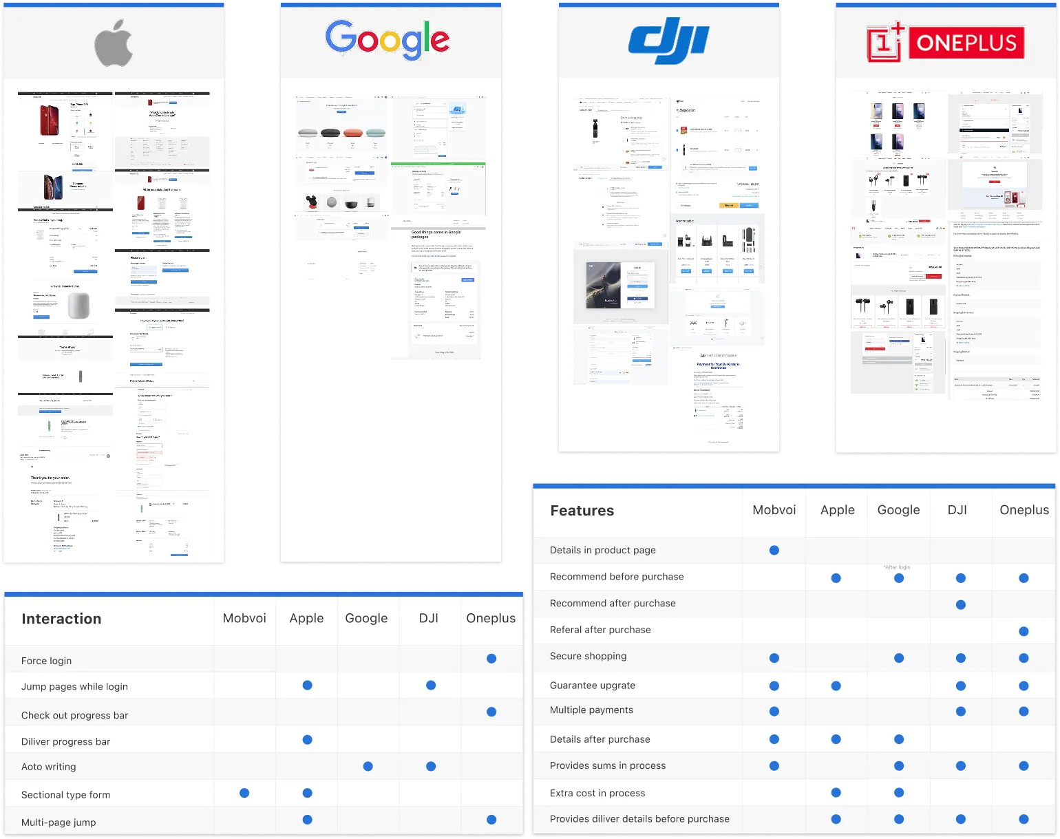
I analyzed the purchase processes of 4 e-commerce official websites that also sell consumer electronics. The business model and operation process of the website are compared in detail.
I found that these websites give users a full sense of security in the purchase based on the brand or clear prompts. The flow is smooth and the page information is complete.
However, there are also somethings are not desirable based on Mobvoi's practical situation such as two similar features display in different pages, forced login and registration, etc.
Based on the user's most concerned points are price, deliver, reliability, and operational simplicity in the user research. so as to optimize the purchase process of Mobvoi.
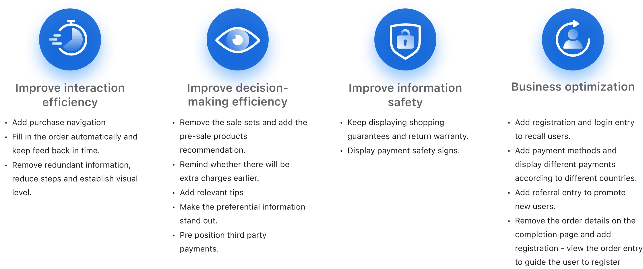
I was able to obtain a series of rules regarding previous product and data analysis, user survey and competitive analysis. These rules run through the whole project, help determine the direction of project design, and support the final design goal.
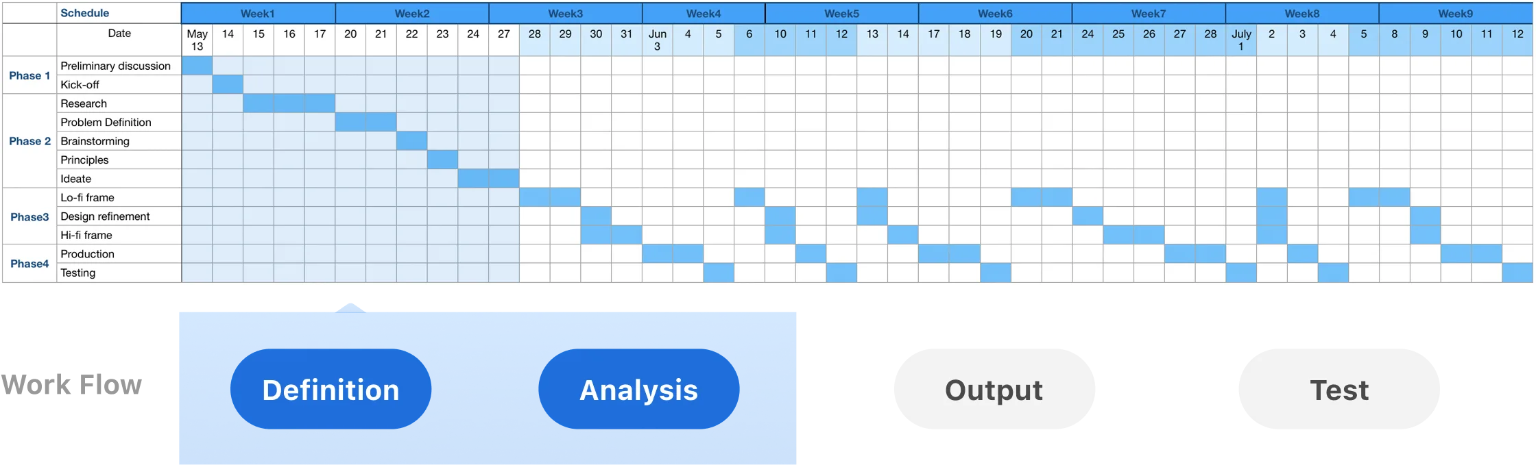
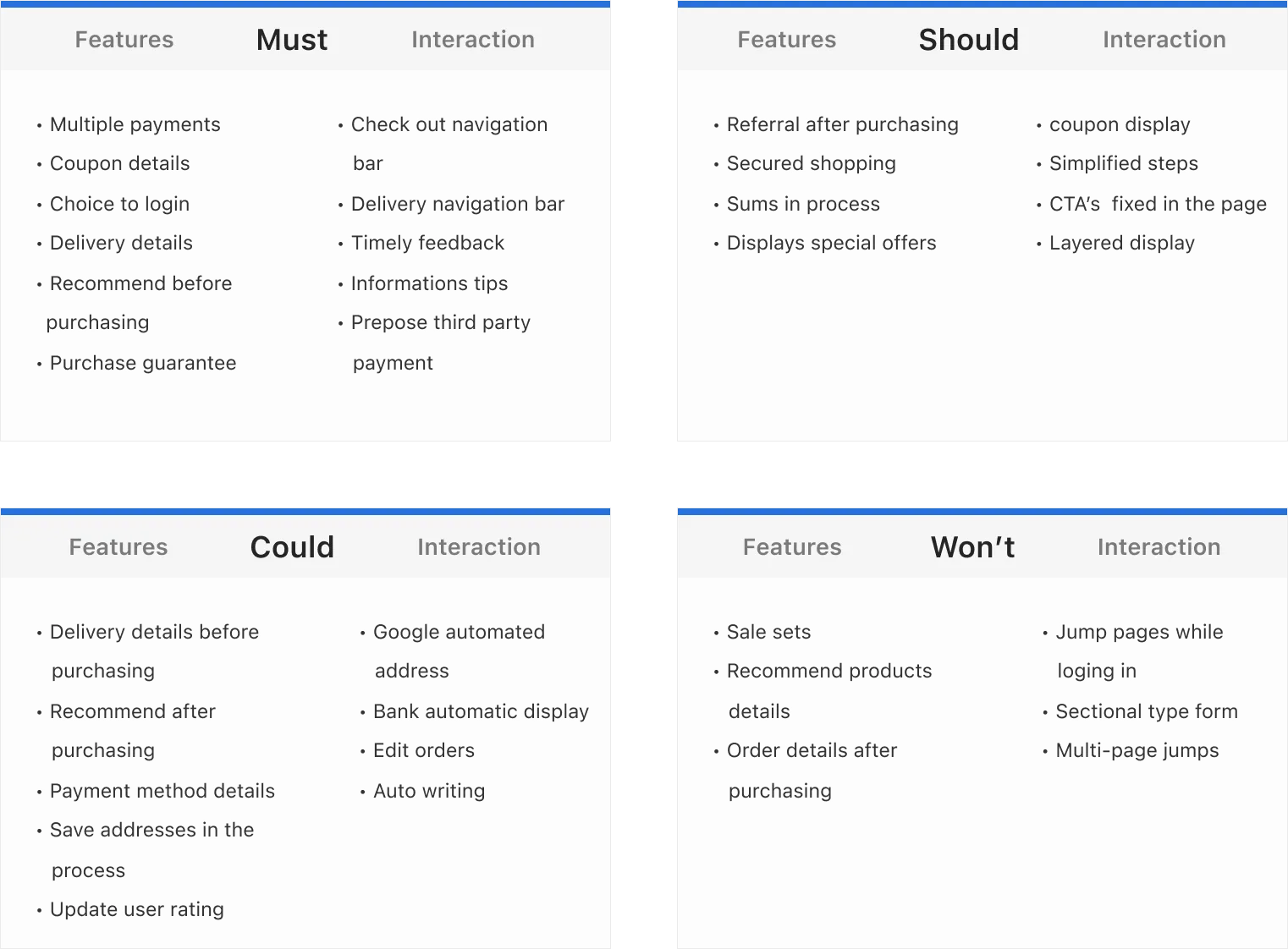
I classified the points extracted from the competitive analysis by using MosCow method, and also used them for project scehduling. I have built an MVP prioritizing the most important issues first, then going to the least ones.
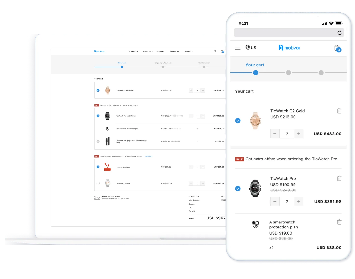
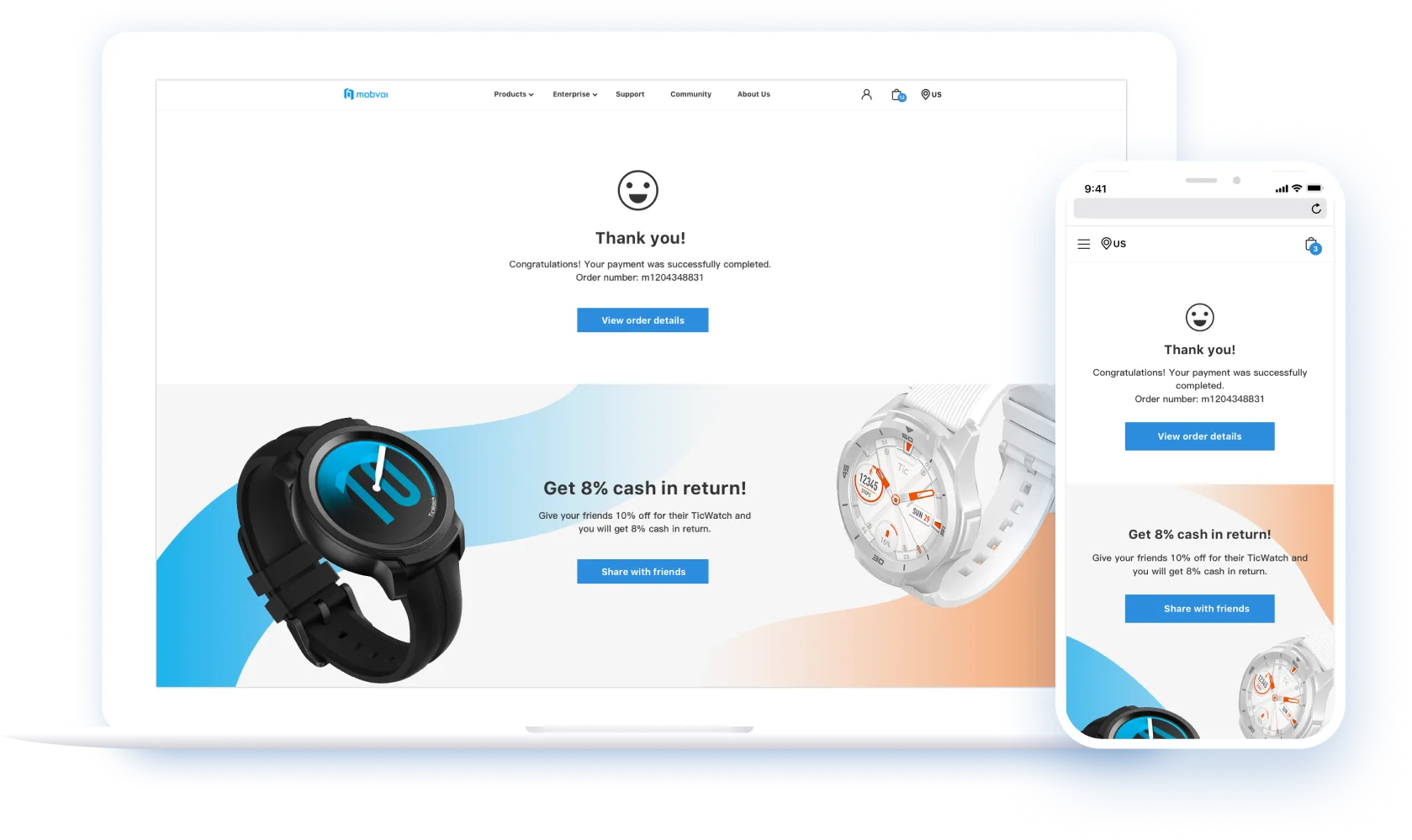
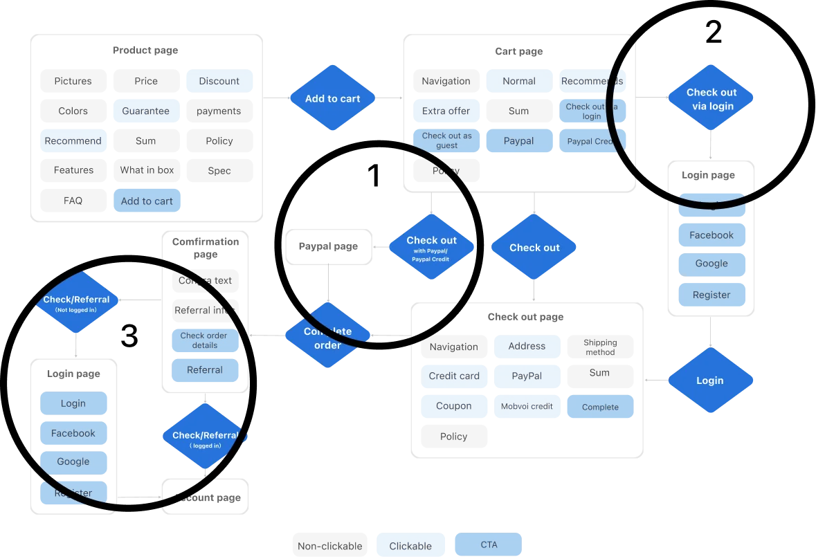
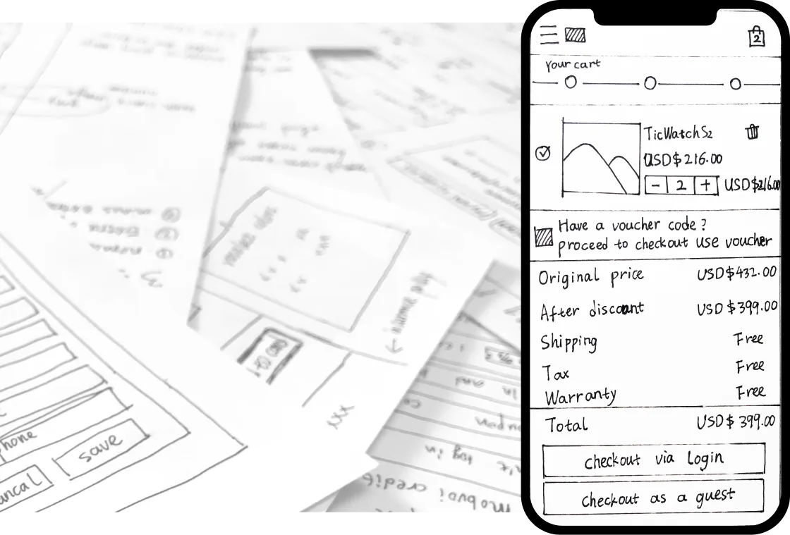
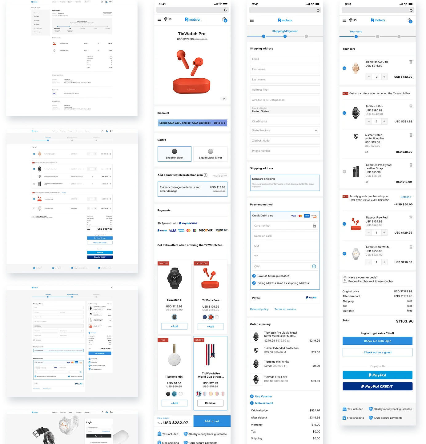
I draw an ideal order flow in order to plan the path to form a complete closed loop of purchase. Design highlights: Guide users to place orders quickly at 3 key points or guide users to register, so that we can mail users with promotion and keep new users growth.
According to the ideal user flow, quickly use wireframe draft for simple interactive testing. Some logical details are revealed in this section, such as the mobile display logic. And interaction compromises are made based on business constraints, such as the need for too much information on the same page due to the advertising leads.
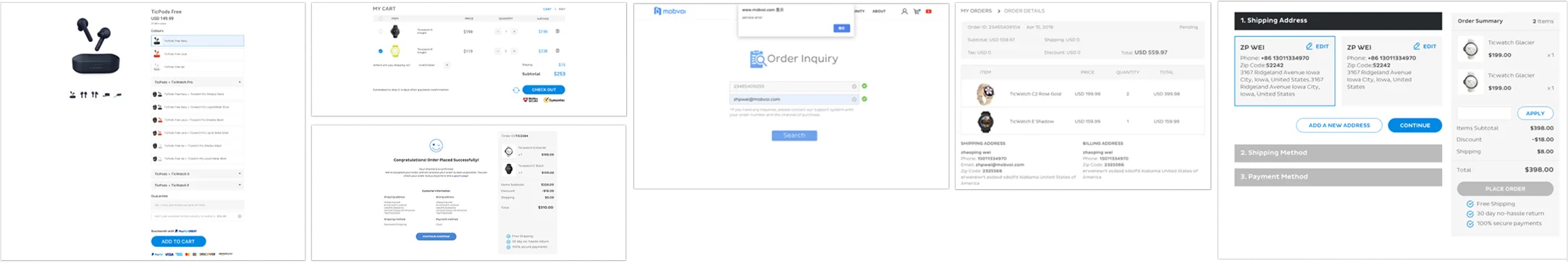
Change the combination of goods to pre-purchase recommendation.
Highlight price differences and discounts.
Provide registration entry and pre-position third-party payment when placing an order.
After placing an order, users can only view the order details on my account page, incase to promote user registration.
Provide recommended entry after placing an order.
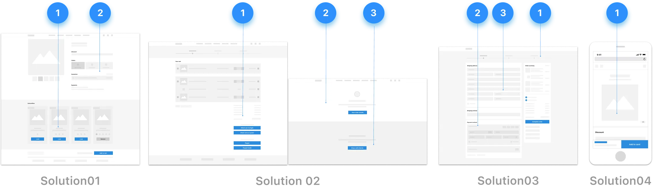
Add step path.
Expand the fill panel.
Add Poka-yoke tips.
Provide design solutions for mobile, such as folding of menus and secondary information.
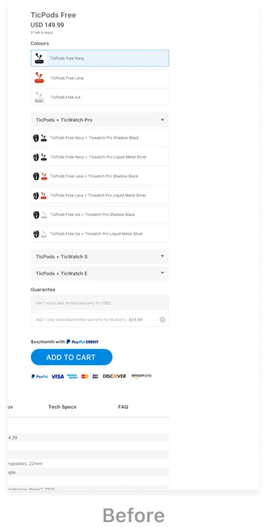
Before
Change the combination of items to pre-purchase recommendation, and move the additional discounted items to the bottom of the page. This scheme makes the decision information of the main commodity more clear, and the SKU options are not too long or folded display, making them easier to choose.
On this basis, the most concerned factor – price preference information is added, and the price preference comparison is clear.
Due to the large amount of information on this page, the placing button and relevant information are fixed at the bottom of the page to improve the placing efficiency.
Security information appears near the order button to enhance the user's sense of security.
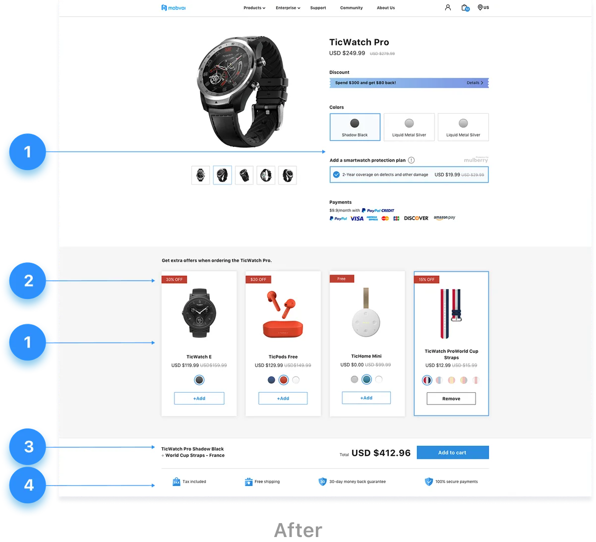
After
After the discussion and design modification of the Lo-fi wireframe, the online version page of hi-fi pages is obtained.
Design iterations
In view of the general design cognition, multiple choices will make users confuse, but the pre-placed multiple payment methods unexpectedly increased the deal rate.
When selecting the color of the recommended discounted products, use reminders instead of pop ups to minimize the operating cost and program feedback time.
The redesign had a positive impact on the trading system. After one month of hitting the shelves, we compared the data before the upgrade and got the result of the redesign. Unfortunately, the length of page session did not fluctuate a lot. Because in same time of improving interaction, it also adds business functions, such as extra offers in shopping cart, multiple payment methods, all this features resulted had added user selection time. However, the changes in operations directly affects the increase of trading volume.
In countries that use pre payment, transaction rates have increased by 20%
Registrations increased by 20%
The average page bounce rate decreased by 13%
Customer complaint rate reduced by 39%
*For reasons of confidentiality, the above data have been omitted and obfuscated.