Current State Analysis
SeaBank (Legacy): Overly cold and simplistic. The lack of polish diminished user trust.
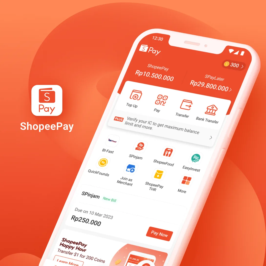
ShopeePay: Inherited vibrant e-commerce DNA. Too energetic to convey financial "security."
Design Objectives
Develop a Figma-native 3D system that blends regional aesthetic trends with financial rigor and high scalability.
Core Pain Points
Efficiency Gap: Traditional 3D workflows are too slow for high-frequency agile iterations.
Collaboration Barrier: Pure 3D tools are not accessible to all regional design teams, as not every market has dedicated 3D specialists.

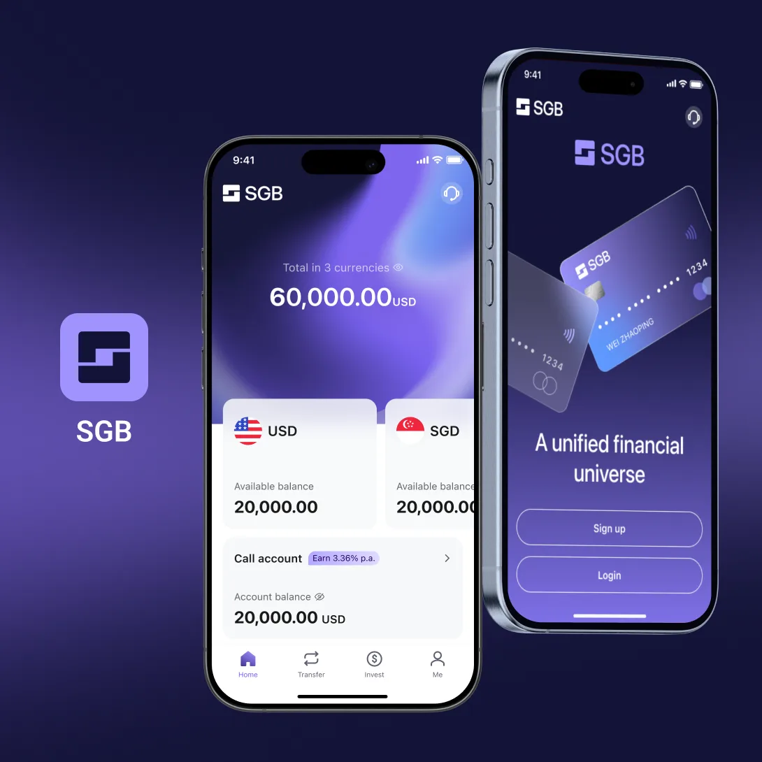
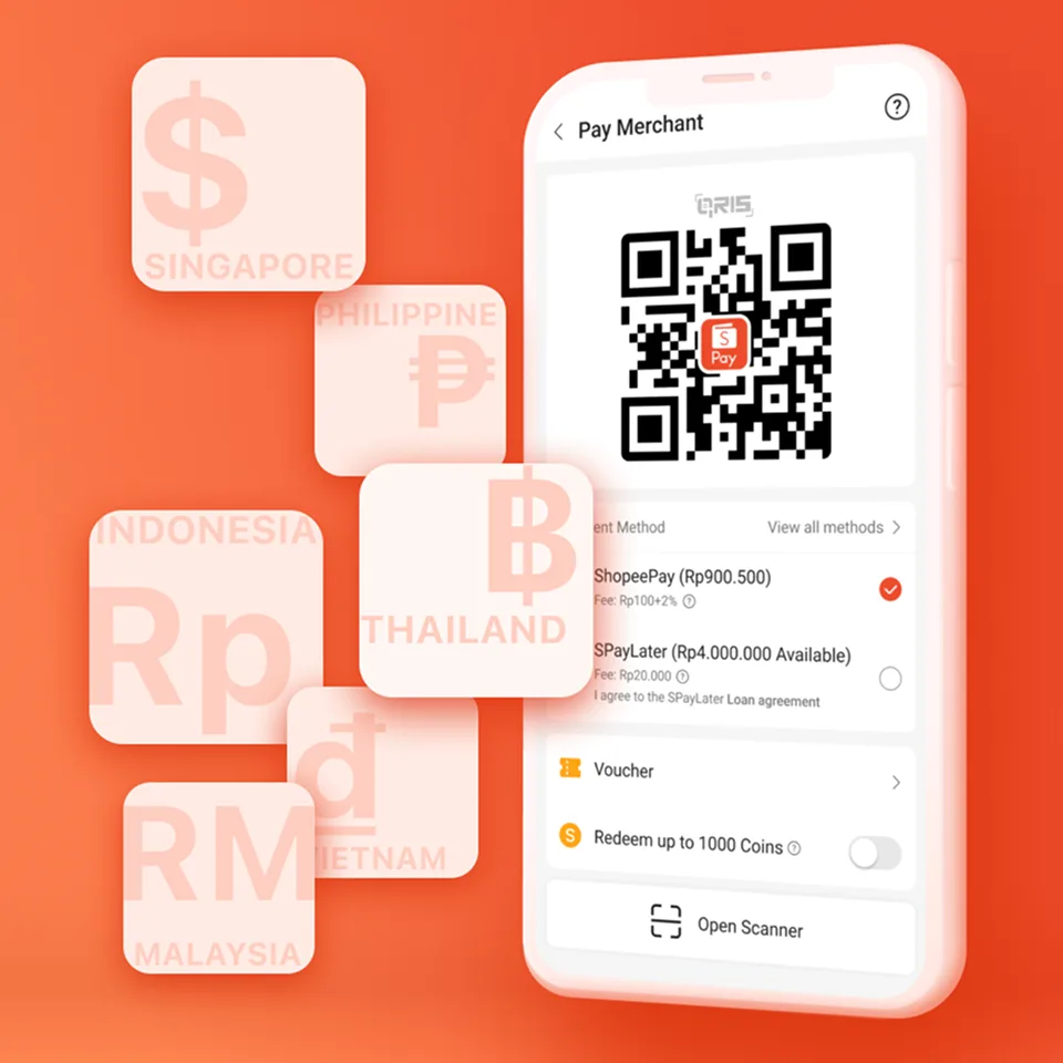
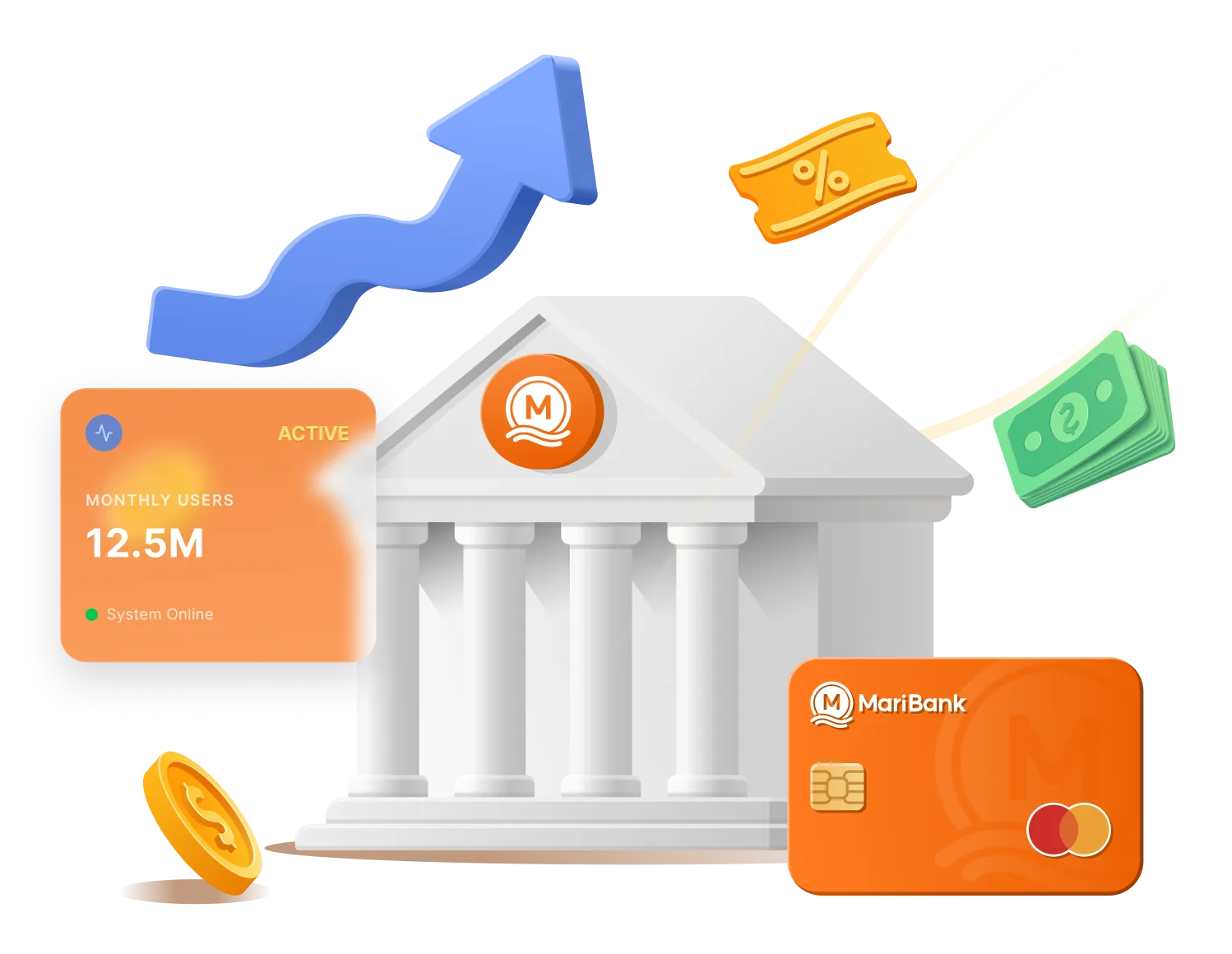
Brand Continuity: As the majority of users originate from Shopee, the design retains its vibrant warm palette to minimize migration friction through brand familiarity.
The "Tangibility" Metaphor: 2.5D depth symbolizes "real assets," providing a stronger "trust dividend" than flat graphics.
Psychological Softening: Rounded corners and soft lighting reduce the perceived "coldness" of finance, lowering user psychological barriers.

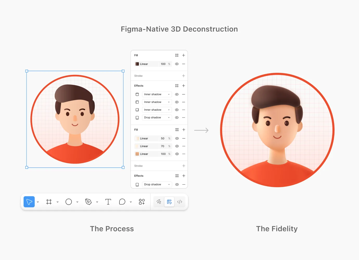
The Path: Figma-Native 3D
Leveraging multi-layered inner shadows and gradients to simulate realistic textures and volume, ensuring high-fidelity results without external 3D software.
The Value: Global Scalability
Accessible to all regional designers in Figma, maintaining 100% visual consistency without 3D training costs.
The Impact: 80% Faster Execution
Reduced production time from 2 days to 2 hours, enabling high-frequency iterations for agile sprints.
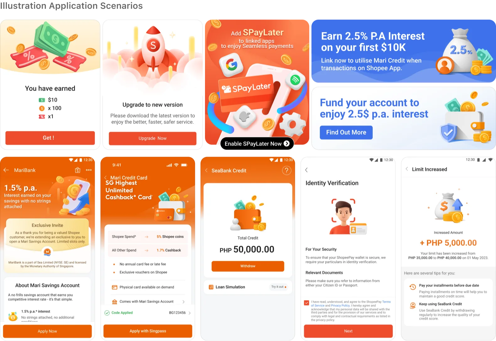
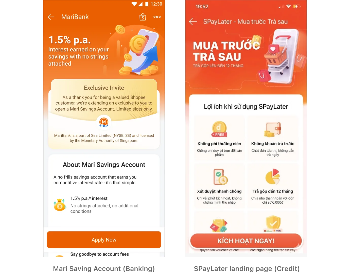
Pilot Projects: Successfully launched in SPayLater landing page (Credit) and Mari Saving Account (Banking).
User Sentiment: Direct feedback highlighted a "Premium yet Friendly" experience, effectively lowering the psychological barriers to banking.
Stakeholder Buy-in: Business leads and management recognized a significant boost in Brand Premium, aligning the visual style with SeaMoney's long-term market positioning.
Standardization: Due to the successful launch and positive reception, the system was officially adopted as the SeaMoney Global Brand Standard, now scaled across all regional markets.
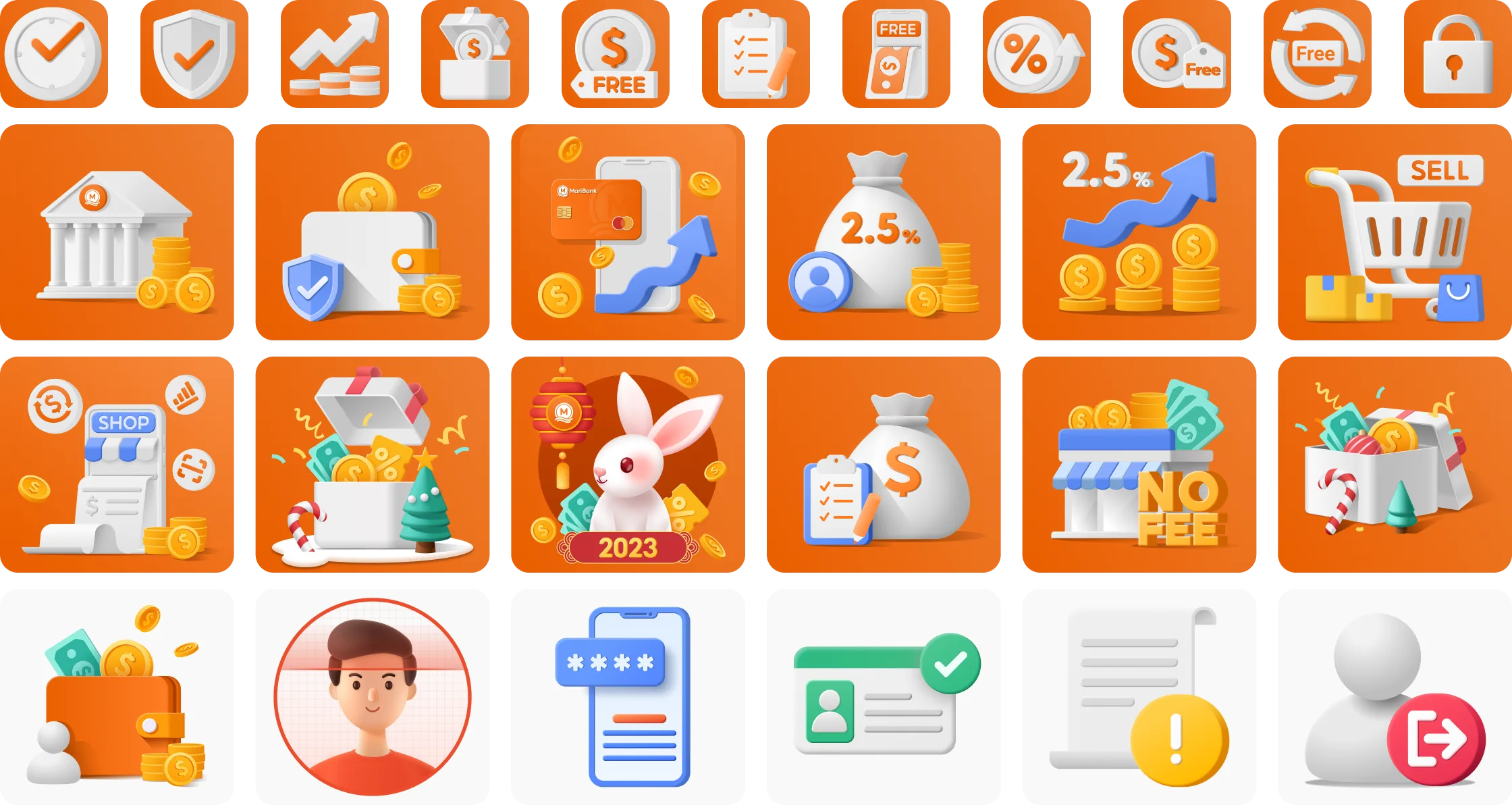
The Four Pillars:
a. Color Palette: Defined high-brightness, "Clean-vibe" gradients to avoid muddy visuals.
b. Lighting Logic: Standardized a 45° top-right light source to create a consistent sense of depth.
c. Geometry: Utilized golden-ratio corner radii to soften sharp edges and convey inclusivity.
d. Atomic Library: Built a library of 50+ modular components (wallets, shields, coins) for "Lego-style" rapid assembly.
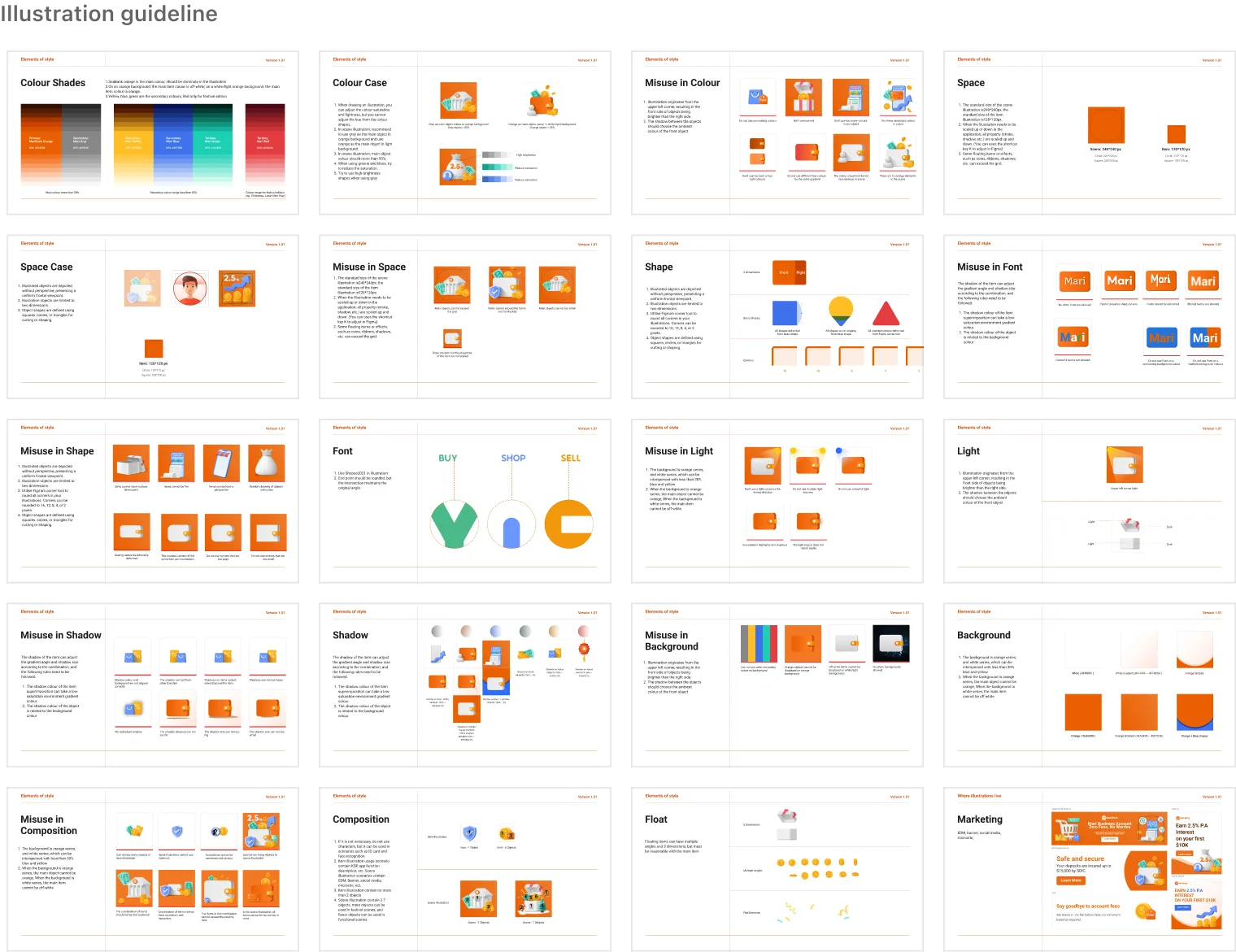
Illustration Elements
Defining the Visual Language of SeaMoney
Achievement: Successfully established the first systematic illustration language for SeaMoney.
Business Value: Reduced visual production costs while empowering business conversion through a professional brand image.
Future Vision: Continuing to expand the asset library and exploring the application of this style in micro-interactions to further enhance the interactive experience.