Singapore Gulf Bank

From 0 to 1

How to quickly start and manage a banking app design project.

SGB App Screens

Due to the confidentiality agreement, some content has been modified

About

SGB Logo

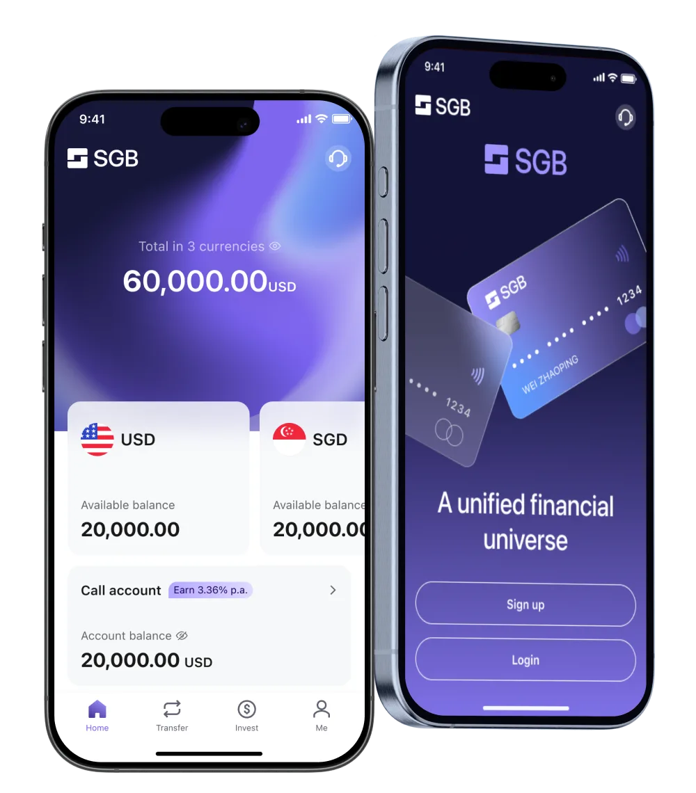
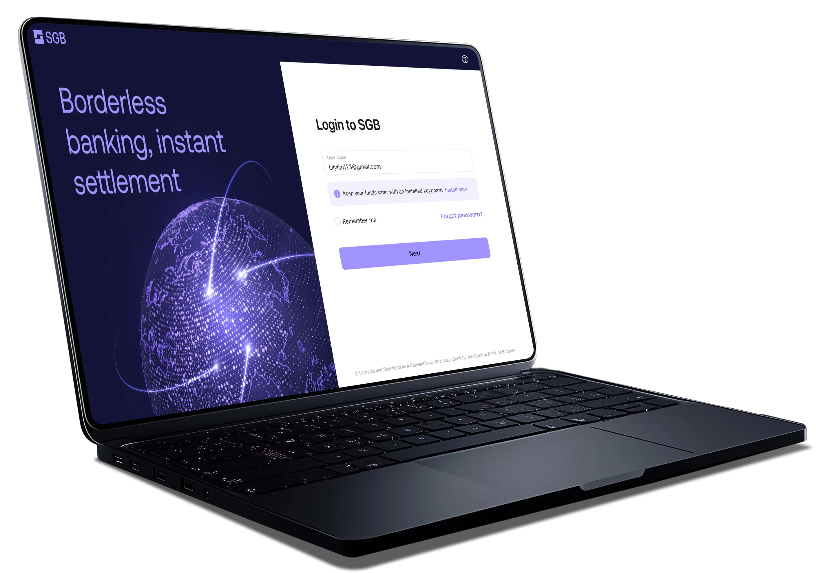
SGB is an innovative new digital bank dedicated to building banking infrastructure for the digital world.

SGB is authorized by the Central Bank of Bahrain (CBB) and is the first bank in Bahrain to be allowed to provide fully digital remote access to global customers

SGB's target user base is users in East Asia, Southeast Asia and the Middle East.

Goal

Goal Icon

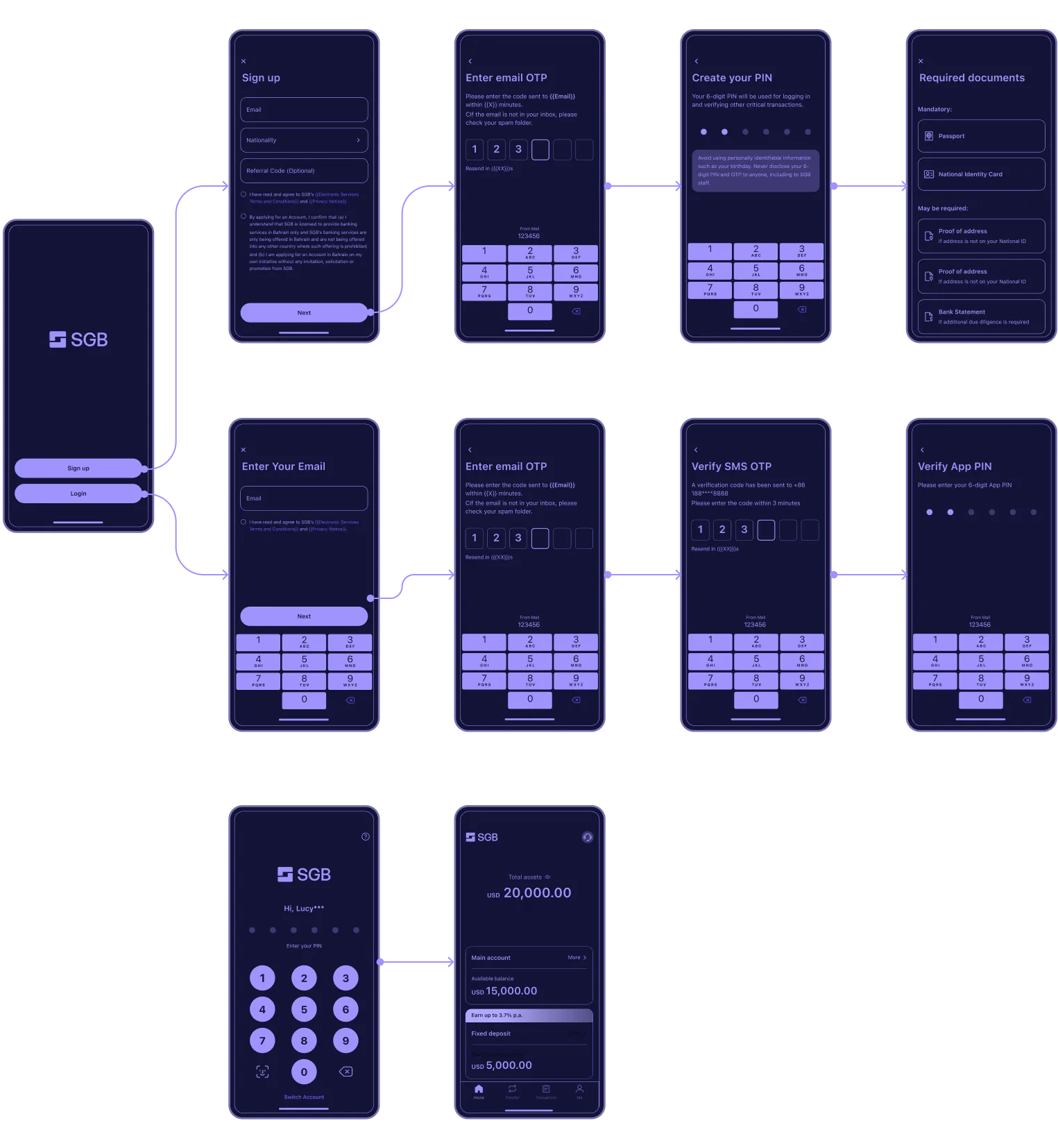
The offshore banking app design is centered around providing users with a reliable, intuitive, and secure way to manage their finances internationally. By integrating intelligent automation, clear UI/UX patterns, and robust security measures, the app ensures that users feel in control, protected, and empowered when handling offshore banking needs.

Key Steps

Visual direction illustration

Visual direction

  • Build a user persona
  • List out branding keyword
  • Mood board workshop.
  • Competitor Research.
  • Design page sample.
Interaction illustration

Interaction

  • User Research
  • Competitive Analysis
  • Regulatory Compliance
  • Define Core Interactions
Component library illustration

Component library

  • Research
  • Component sorting
  • Design specification
  • Adaptation and development
  • Component library iteration

Interaction

Design Goals: Clarity, Usability, Familiarity, and Security.

The core of the offshore banking app's interaction design is security, ease of use, efficiency, and compliance. Each process should focus on "reducing user decision-making costs, while enhancing security and trust."

For example, the account opening process:

  • Minimize User Input: Use OCR to scan ID cards and automatically fill in phone numbers.
  • Real-time Feedback: Provide immediate error messages instead of waiting until submission.
  • Visual Progress Bar: Help users understand the time required to complete the account opening process.
Interaction flow screens

Component library

  1. Component library requirements: fast development, multi-language, and financial products
  2. Research: Shopee-good at multi-language; Maribank-similar products with complete financial components; TDesign-very detailed functional type classification. Vant Library-There is a corresponding front-end component library.
  3. Component sorting: basic components-buttons, input boxes, labels, etc. Functional components-PIN, OTP, etc. Scenario components-transaction history, transaction details, etc.
  4. Design specification: 8px grid system, mobile system default font. Modify brand color to adapt to UI requirements.
  1. Adaptation and development: For rapid development, design components will find the corresponding front-end component library to cooperate. The corresponding components can use Vant (development default), Vuetify (suitable for multi-language) development component library to cooperate. Financial components have almost no adapted front-end components and can only be developed from scratch.
  2. Component library iteration: components will be added and modified according to business needs.
  3. Web version component library: basically similar to the mobile version on atomic component, but some necessary functional components will be modified according to web interaction.
Component Library
App pages display
SGB App Pages
Corporate Portal on laptop

Corporate Portal

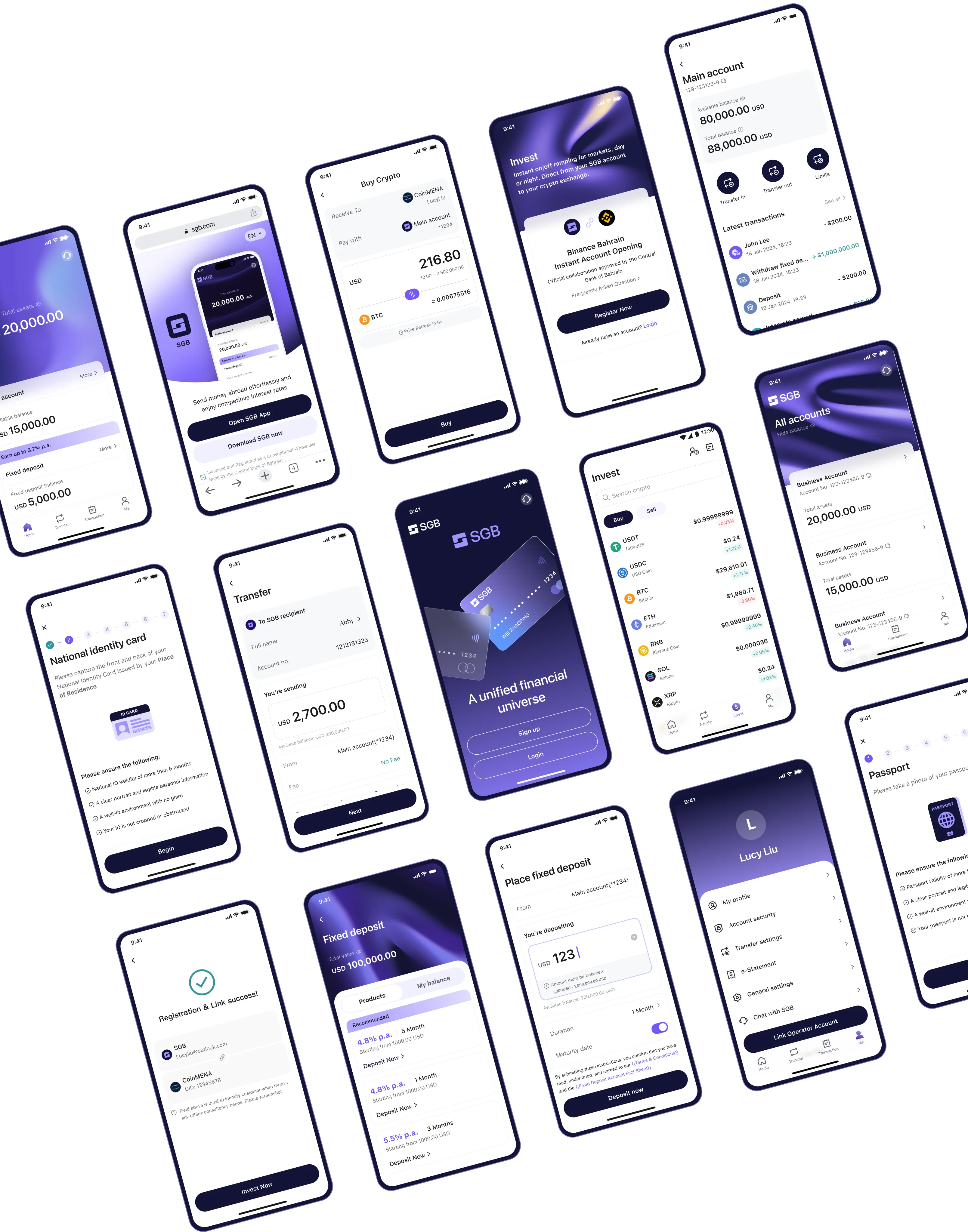
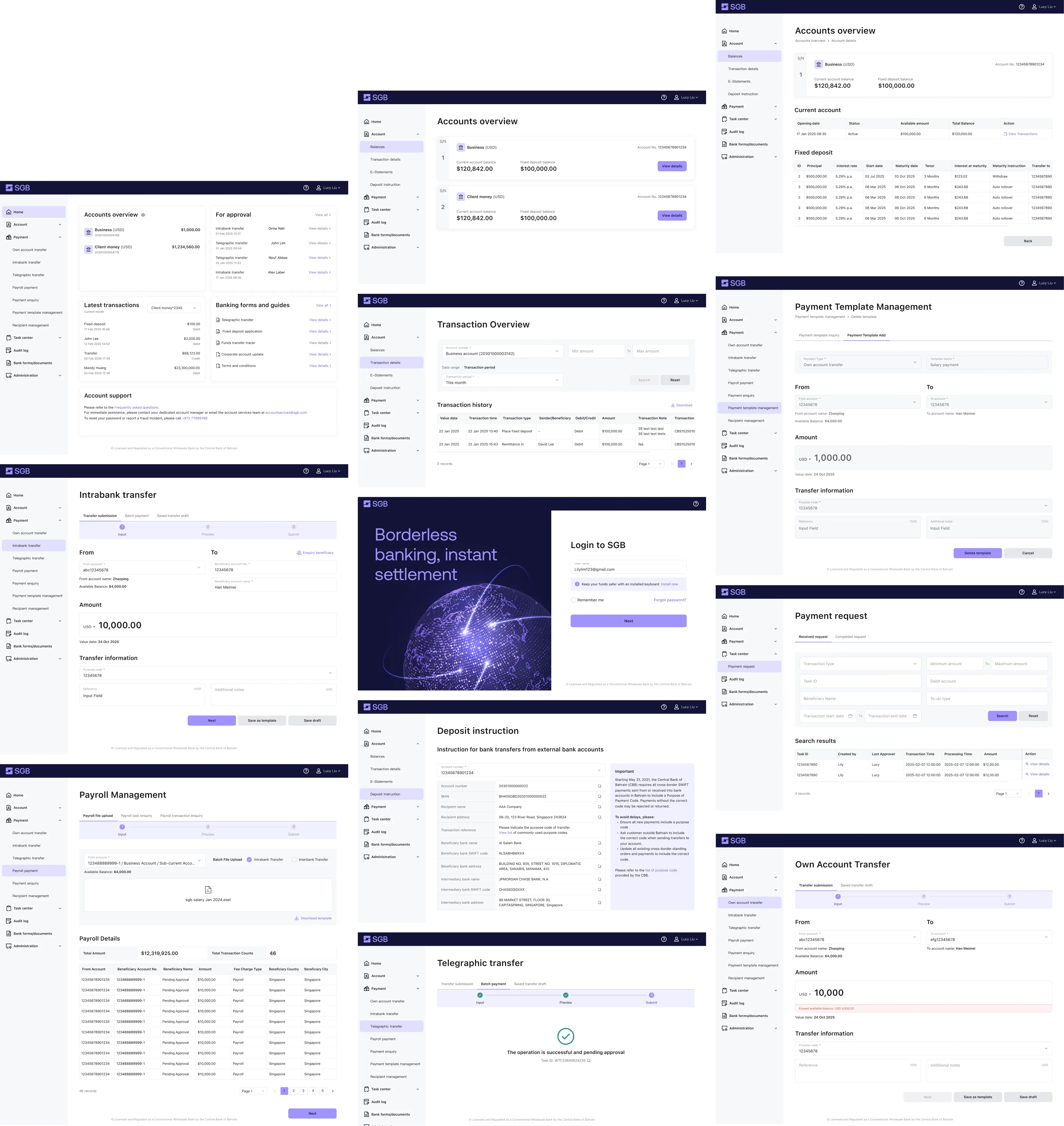
Corporate E-Banking channel is used by corporate users to manage their finance, including transfer, salary payment, financial approval, etc. The design is based on the existing core banking system.

This means that the general flow of functions remains unchanged, and only the UI design is modified.

Website pages display

Website pages display

Wrap up

Industry Insights

  • Build Trust and Confidence: Trust is the foundation of any financial product.
  • Reduce Cognitive Load & Simplify Complex Flows: Financial processes can be long, filled with jargon (KYC, AML, OTP), and bureaucracy.
  • Emphasize Security & Permission Control: Financial data is highly sensitive — security breaches can destroy user confidence.
  • Compliance-Driven Design: Finance is heavily regulated — KYC, AML, data retention, audit logs, etc.
  • Multilingual UI/UX Design: Font & Typography Adaptation, Date, Number & Currency Formatting, Cultural Sensitivity & Context Awareness, etc.

Problems faced and solutions

  • Issue 1: All the OCS, SDKs, Core systems, and development component libraries are outsourced and pre-built, leaving limited room for customization. This inevitably compromises user-friendliness. As a designer, the best I can do is to optimize within these constraints — making every step as smooth and intuitive as possible, prioritizing quick action to avoid user confusion.
  • Issue 2: The product flow was developed before any branding was defined, and a single designer is responsible for all UI/UX and visual design. In this case, the app should aim for visual consistency early on, with brand elements introduced later in key touchpoints to strengthen identity. When building the component library from the start, it's also essential to establish a mindset oriented toward future iteration and scalability.

Click and Drag

Spline preview

See More Works